
The 2016 Presidential Race, Explained in 4 Charts
Written by Andrew Stiles
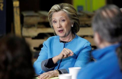
The 2016 presidential election will feature a matchup between a white millionaire Yale graduate from the Democratic Party (Hillary Clinton) and whichever candidate emerges from the diverse Republican field.
How diverse is this year’s crop of GOP candidates? It might be the most diverse in history, regardless of party. Let’s take a look at the current state of the 2016 race, using charts to explain everything you need to know.
1. Democrats have few serious candidates
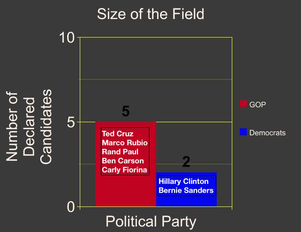
Note: The GOP field is expected to grow much larger in the coming months and may include the likes of Mike Huckabee, Jeb Bush, Scott Walker, Rick Perry, Rick Santorum, and Bobby Jindal, among others. The Democratic field may or may not get any bigger.
2. Democrats are very old
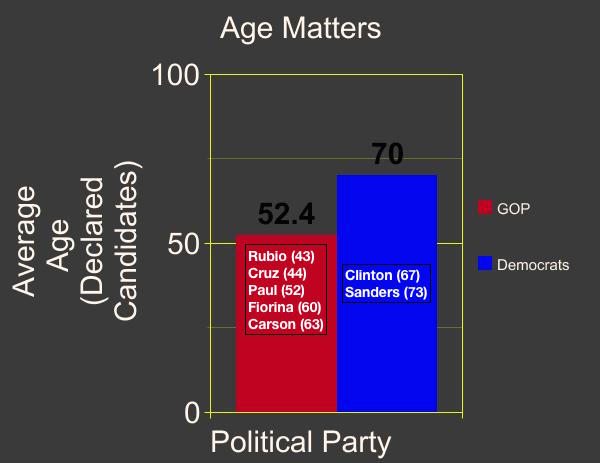
Note: Bernie Sanders has a son who is older than Marco Rubio, a sitting senator who is just eight years older than Chelsea Clinton.
3. Democrats are very white
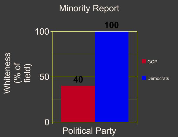
Note: The candidates most likely to enter the race on the Democratic side—Joe Biden, Jim Webb, and Martin O’Malley—are all white men (average age: 64).
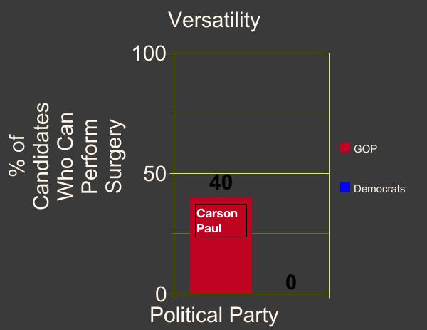
4. Democrats lack critical lifesaving skills
This article was originally posted at The Washington Free Beacon website.
Tags: Ben Carson, Bernie Sanders, Bobby Jindal, Carly Fiorina, Election 2016, Hillary Clinton, Jeb Bush, Jim Webb, Joe Biden, Marco Rubio, Martin O’Malley, Mike Huckabee, Rand Paul, Rick Perry, Rick Santorum, Scott Walker, Ted Cruz
![]() Uncategorized | David E. Smith |
Uncategorized | David E. Smith | ![]() May 5, 2015 10:30 AM
May 5, 2015 10:30 AM